Making a House a Home Using Exterior Color
Homeowners have long used exterior color and accent details to refresh the style of a lived-in home or to make a new house their own, rightly reasoning that the exterior represents the individual or family living inside.
Color preferences tend to vary geographically, with deeper colors growing in popularity in the Midwest, for example. Within regions, the look and feel of different cities, towns, and streetscapes also influence color choices. No one says all the houses on the block have to look cookie-cutter similar, but it’s wise to consider regional and local color trends before adopting a new palette.
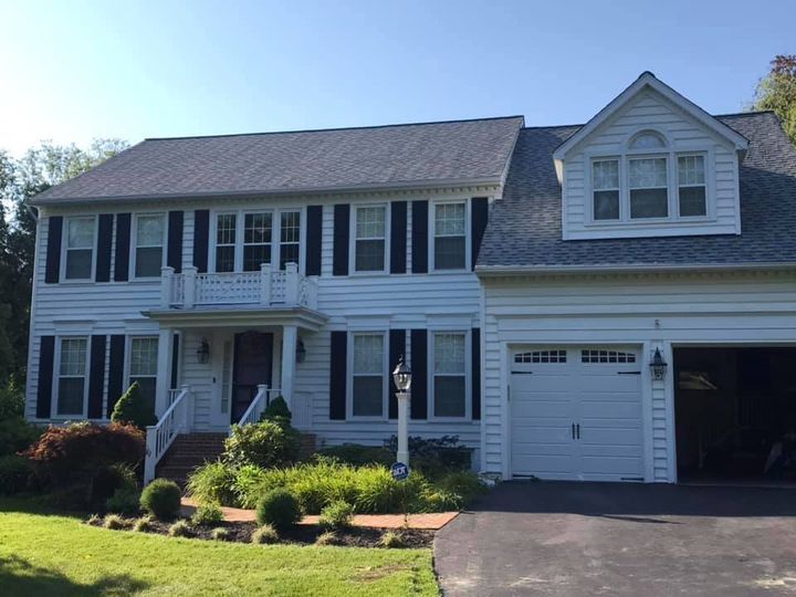
Architectural styles matter too. Take a look around your neighborhood. Craftsman bungalows, New Orleans shotguns, Victorian painted ladies, Cape Cods, Colonials—which style or styles dominate your area? How do you see color being used to reinforce the style of houses like yours?
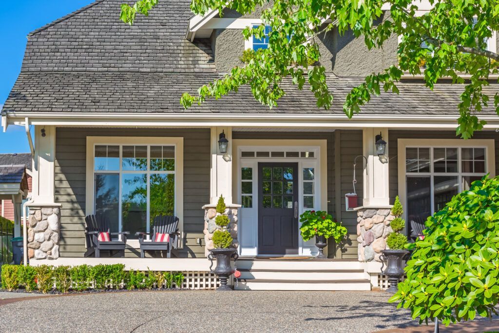
The first choice, of course, is the color or colors—never more than two—for the siding. Next come the trim color and then a contrasting color for the doors and shutters. Three hues should do it, unless your house has an unusual number of architectural features, like those seen on some Victorian-era gems.
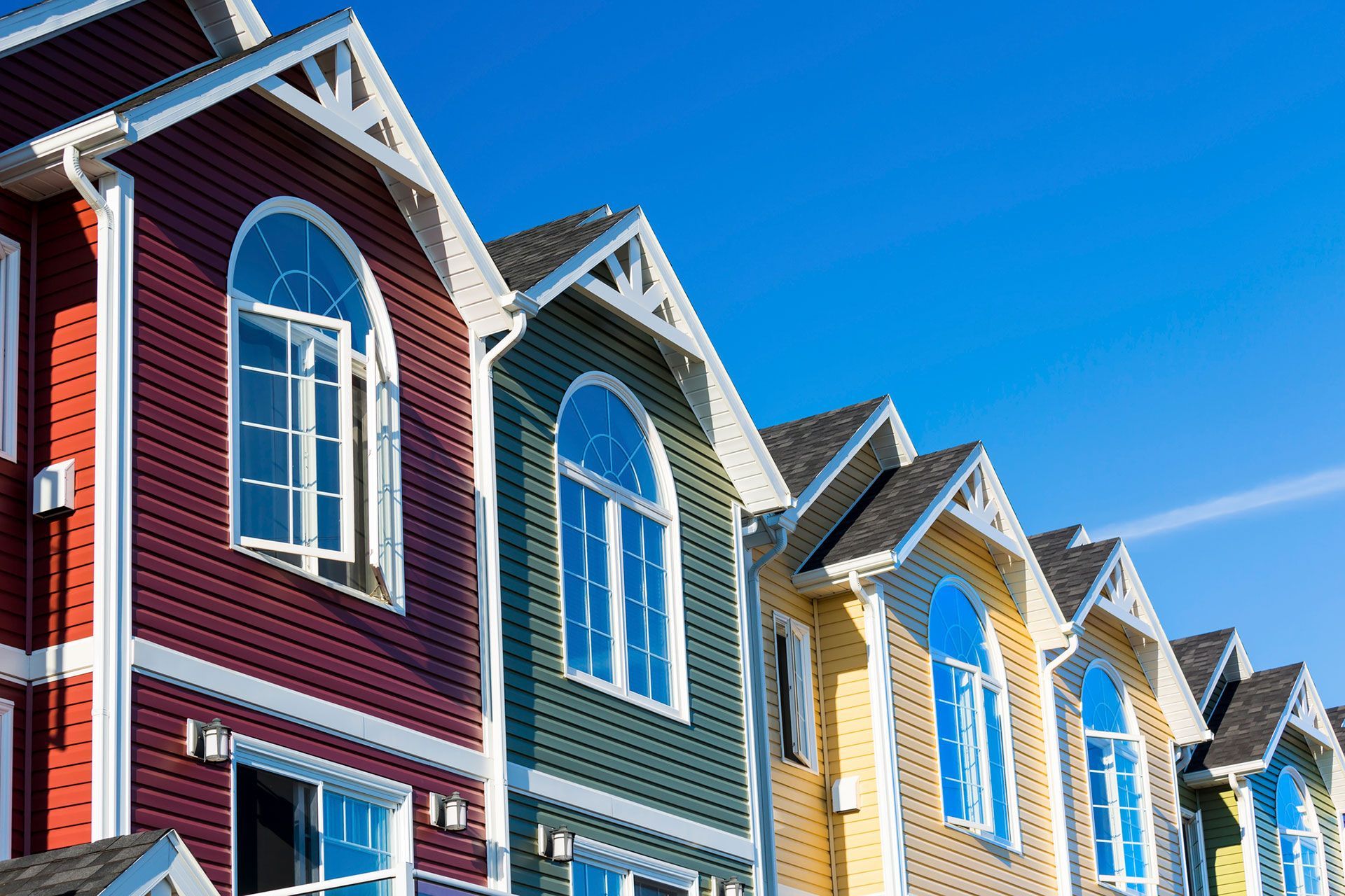
Luckily, your color choices won’t be confined to paint, as a number of building materials now come in a choice of colors. Exterior fiber cement siding and trim manufactured by James Hardie, for example, are available in 20 colors. The company uses a multicoat, baked-on application process called ColorPlus® Technology to create a vibrant, consistent finish.
So, how to choose that first important color? Designers often draw from the color wheel, teaming two or three analogous colors or colors found side by side on the wheel, such as orange and yellow. Another popular approach pairs complementary colors, which sit opposite each other on the wheel, like orange and blue, proving that “opposites” attract. When put together, they bring out the best in each other, making both colors look cleaner and brighter than if either were mixed with, say, a neutral gray or a different shade of the same hue. A neutral can be added to one of these pairings as long as it shares one of the undertones.
For some houses, especially those made with natural materials like stone, monochromatic schemes—two shades of green, for example—work best.
Whatever you decide, ColorPlus® siding has options to choose from. Curated by color professional Leslie Harrington, the palette is designed for easy mixing and matching, opening the door for pleasing, low-risk color schemes.
Beyond aesthetics, ColorPlus® Technology lasts up to two times longer than a new coat of paint and has better fade resistance and improved adhesion. The upshot: less need to repaint over time and thus lower maintenance.
From siding to all the little details, color can make a house a home. To learn more about the James Hardie siding and trim with ColorPlus® Technology, please visit here.